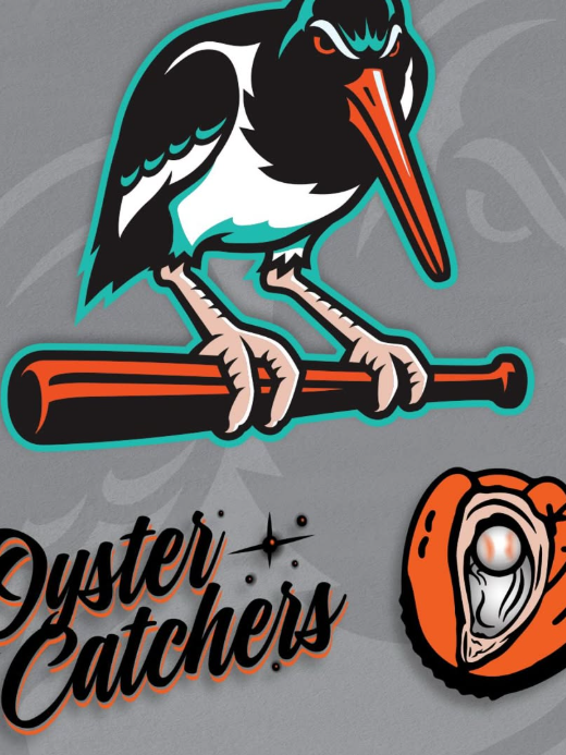
The Chesapeake Baysox, the Double-A affiliate of the Baltimore Orioles, introduced their new alternate identity for the 2025 season: the Chesapeake Oyster Catchers. Intended as a tribute to the Chesapeake Bay’s rich heritage and the American oystercatcher bird, the unveiling came with a pair of logos—one of which quickly stirred up a storm of controversy.
The primary logo features an oystercatche

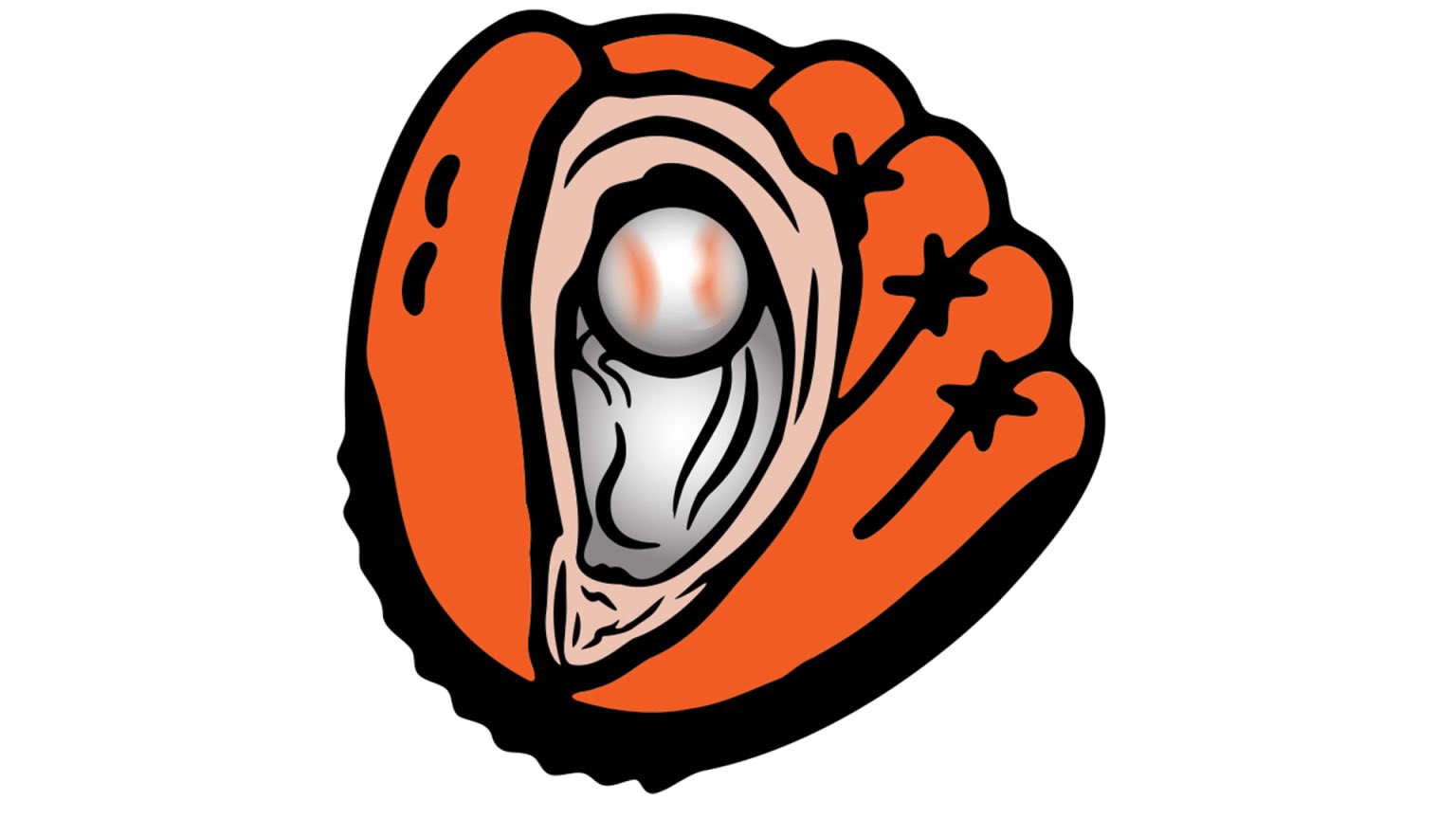
However, it was the secondary logo—a catcher’s mitt with an oyster shell and a baseball as the “pearl”—that caught everyone’s attention.
Social media erupted with reactions, as many pointed out its unintended resemblance to the female reproductive system. The Baysox initially pulled the logo from their platforms, but the viral moment was already in full swing.
Rather than shy away, the team leaned into the buzz, announcing that 10% of Oyster Catchers merchandise sales would support Cervivor, a nonprofit focused on early cervical cancer detection—turning an awkward misstep into a charitable opportunity.
While the logo awaits MiLB approval, the Baysox are embracing the unexpected spotlight, proving that even a design faux pas can become a force for good. Fans can grab the gear and join the conversation as this quirky chapter unfolds!

